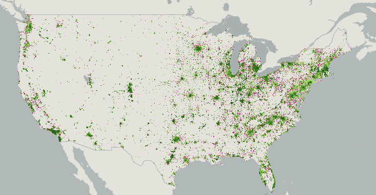
This is from Bonnie Bracey Sutton, director of the PowerofUS Foundation. The power of crowdsourcing is put to good use in the National Broadband Map. The map has a built-in tool to find out your broadband speed and add your data to the map of the US. So it’s not just informative, it’s a powerful crowdsourcing initiative. (Just a warning, the maps take a long time to appear - I guess you need some heavy duty bandwidth to show the bandwidth maps!)
Sylvia
More from Bonnie:
Last week some of us were treated to a sharing of the National Broadband Map - this was from the office of Karen Cator at the Dept of Education and they shared data on the schools at CoSN.
The map is also a tool for your use. Here is what you can do with it. You can go to your school board and demonstrate broadband use in your community. You can share your speed and help to fill out the National Broadband Map. In case you missed it, it is a kind of citizen transparency project.
It is an amazing tool and the website includes some great resources (like this workshop plan and presentation) to help use and analyze the data. The Dept of Education and NTIA collaborated on that presentation.

Consumer Broadband Test vs Advertised (pink is less than advertised, green is as advertised, dark green is more than advertised)
Analyzing the Data
Use the tools on the map to rank an area by a specific broadband attribute, You can generate summaries of broadband availability for a given area and download reports containing popular statistics. This should be helpful to your learning community, your school board, and local consumers.
Some other ideas:
- Use the rank tool to compare broadband availability in different areas.
- Generate a national list of states, counties, Metropolitan Statistical Areas (MSA), Congressional Districts, census designated places or Universal Service Fund (USF) study areas by broadband speed, technology, number of broadband providers or demographic information.
- Generate ranked lists within a state, including by county, census designated place, Congressional District, state legislative district, MSA and USF study area.
- Use this tool to generate an overview of broadband availability for any state, county, state legislative district, Metropolitan Statistical Area (MSA), Universal Service Fund (USF) study area, or Native Nations.
- View and download popular reports in PDF form such as: Broadband Availability in Urban vs. Rural Areas, Number of Providers by Speed Tier, Access to Broadband Technology by Speed
Why don’t we know this already?
Measuring Internet access has been tricky for years. Sascha Meinrath of the New America Foundation explains that detailed network data about speeds, latency, jitter, and more used to be in the public domain until the government-run NSFnet was privatized in the earlier 1990s. Today, though, it’s hard to know what speeds ISPs are actually offering (knowing what speeds they advertise, by contrast, is simple).
M-Lab, a partnership between the New America Foundation and Google meant to measure Internet connections, has given Google two years worth of actual broadband connection data, as measured by users. That’s more than 300TB of data, which Google has imported into its Public Data Explorer for easy viewing and analysis. The results are remarkable.
M-Lab has distributed testing tools for two years now and its servers have recorded data on the results. One of the most basic measurements is pure speed, measured in megabits per second. When these real-world speeds are charted on a map, they make Internet speed differences obvious in a way often obscured by simple lists and numbers.
M-Lab is one of many projects exploring ways to help users more clearly understand the performance of their broadband connections. If you’re interested in exploring further, here are more tools and resources from the FCC, Electronic Frontier Foundation, and more.
